Hey design lovers!
Color isn’t just decoration—it’s one of the most powerful tools in interior design. It can completely transform how a space feels, functions, and even how people behave within it. From calming bedrooms to energizing workspaces, the right color palette can elevate an interior from ordinary to unforgettable 🌟
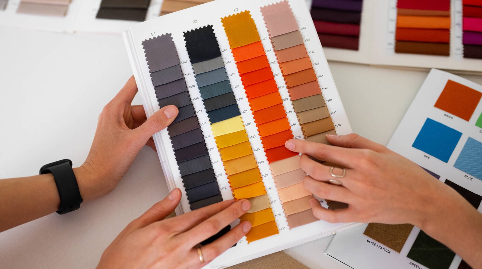
At Anant Design Studio, we use color intentionally. Let’s explore how color theory works and how you can harness the power of palette to create beautiful, balanced, and emotionally engaging interiors.
What Is Color Theory?
Color theory is the study of how colors interact with one another and how they affect human perception and emotion. In interior design, color theory helps us create harmonious palettes that feel cohesive rather than chaotic.
Understanding color theory allows designers to:
- Set the mood of a space
- Enhance architectural features
- Influence emotions and behavior
- Create visual balance and flow
Whether you want a space that feels cozy, vibrant, elegant, or serene, color theory is the foundation that makes it happen.
The Color Wheel: A Designer’s Best Friend
The color wheel is a visual guide that organizes colors based on their relationships. It’s essential for building effective palettes.
Primary Colors: Red, yellow, and blue are the building blocks of all other colors. They can’t be created by mixing other colors and are often used as bold accents in interiors.
Secondary Colors: Orange, green, and violet are created by mixing two primary colors. These hues are versatile and commonly used as dominant or secondary tones in interiors.
Tertiary Colors: These are made by mixing a primary color with a secondary color, such as blue-green or yellow-orange. Tertiary colors add depth and sophistication to a palette and are often favored in modern interior design.
Color Harmony: Creating Visual Balance
Color harmony refers to pleasing combinations of colors that create balance and unity. Some of the most common harmony schemes include:
Monochromatic: This scheme uses variations of a single color—different shades, tints, and tones. Monochromatic palettes feel calm, elegant, and cohesive, making them ideal for minimalist or contemporary spaces.
Complementary: Complementary colors sit opposite each other on the color wheel, such as blue and orange. This scheme creates strong contrast and visual interest, perfect for accent walls, artwork, or statement furniture.
Analogous: Analogous colors sit next to each other on the wheel, like blue, green, and yellow. This approach creates soft, natural harmony and works beautifully in living rooms and open-plan spaces.
Triadic: Triadic palettes use three colors evenly spaced on the color wheel, such as red, yellow, and blue. This combination is vibrant and energetic, ideal for creative spaces or bold interiors.
Color Psychology: How Colors Make Us Feel
Colors don’t just affect how a space looks—they influence how we feel within it. Understanding color psychology helps designers create emotionally responsive environments.
- Red: Passion, energy, warmth. Best used as an accent in dining rooms or social spaces.
- Blue: Calm, trust, serenity. Ideal for bedrooms, bathrooms, and offices.
- Yellow: Happiness, optimism, creativity. Works well in kitchens, studios, or children’s spaces.
- Green: Balance, nature, growth. A versatile choice for living areas and wellness spaces.
- Neutrals: Sophistication, balance, flexibility. Shades of white, beige, gray, and black provide a timeless base and allow other colors to shine.
Applying Color Theory in Interior Design
Knowing color theory is one thing—applying it effectively is where design expertise truly shows.
The 60–30–10 Rule
This classic interior design rule helps maintain balance:
- 60% dominant color (walls, large surfaces)
- 30% secondary color (furniture, textiles)
- 10% accent color (art, cushions, décor)
This ratio creates visual structure without overwhelming the space.
Designing for Purpose: Always consider the function of the space. Kitchens, gyms, and workspaces benefit from energizing colors, while bedrooms and reading nooks call for calming tones.
Lighting Matters: Color changes depending on lighting. Natural light, warm artificial light, and cool LED lighting all affect how a color appears. Always test paint samples and materials in different lighting conditions before finalizing.
Balancing Warm and Cool Tones: A well-designed interior balances warm and cool colors. Pairing warm woods with cool blues or soft grays with warm neutrals creates depth and harmony.
Popular Color Trends in Interior Design
While trends evolve, some palettes continue to dominate modern interiors:
- Earthy tones and natural neutrals inspired by nature
- Bold, moody hues like deep greens, navy blues, and rich burgundy
- Soft pastels and warm whites for airy, light-filled spaces
At Anant Design Studio, we blend trends with timeless design to ensure your space feels current without becoming dated.
Practical Tips for Using Color Successfully
- Start with a mood board to visualize your palette
- Use color to create continuity between rooms
- Let furniture and materials guide your color choices
- Don’t be afraid to experiment—but keep balance in mind
Final Thoughts: The Power of Palette
Color is more than a finishing touch—it’s a design language. When applied thoughtfully, color enhances architecture, supports functionality, and creates meaningful experiences within a space.
By understanding color theory and using it strategically, you can transform interiors into environments that truly feel right. At Anant Design Studio, we believe the perfect palette has the power to shape how you live, work, and feel—one color at a time